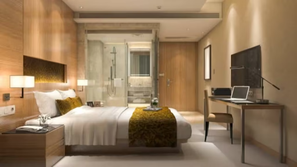
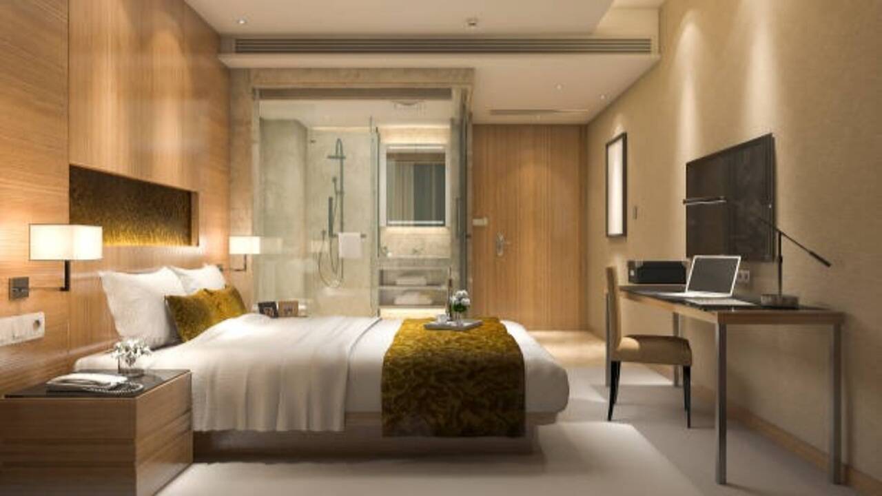
Walk into most luxury hotel rooms, and you’ll notice what’s missing more than what’s there bold clashing colours are rare. Beige, cream, light grey, taupe, and warm white dominate for a reason: they keep things calm while quietly making a room look brighter and bigger than it actually is. Fewer competing colours means less for the eye to sort through, so the whole space reads as more put-together. Personality can still come through cushions, art, or a few plants; just keep the base palette cohesive rather than scattered, and the room instantly feels more considered.